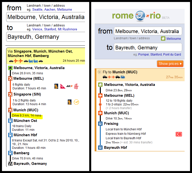
We’ve spent a lot of time thinking about rome2rio’s user interface. The graphic design has had a major revamp over the last few weeks, thanks largely due to the contributions of my talented sister, Lara Cameron. Lara is now busy running her popular and eco-friendly hand-printed textiles business Ink & Spindle but was previously a web graphic designer. Take a look at this comparison of our UI before and after the makeover and it is clear Lara benefited from some creative, artistic genes that I missed out on.
The other major aspect of rome2rio’s interface is the interaction design, that is, what is shown where on the page and how the user interacts with the site. Getting the interaction design right is certainly one of the big challenges of building a multi-modal travel search engine. There’s a lot of information to present about the various trip alternatives. Conveying these ways to get from one place to another clearly to the user is challenging. Even regular flight search engines such as Kayak, Orbitz, Expedia or Webjet struggle with the challenge of presenting just flight itineraries to the user. There are different carriers, stopovers, layover times, ticketing airlines, departure and arrival times, durations and prices that need to be shown. Hipmunk is a new valley startup that has focused on some new approaches to this challenging flight result layout problem.
With multi-modal search rome2rio needs to tackle yet another level of UI complexity as the flight schedules are just one part of the itineraries we present. For a single search such as Melbourne to Stanford, rome2rio presents multiple routes of getting there. For example Melbourne -> MEL -> SFO -> Stanford is one route, Melbourne -> MEL -> SJC -> Stanford is another. Each route consists of various segments (drive, then fly, then drive again), each flight segment has various itineraries, and each itinerary has all of the components described above!
Presenting all this clearly to the user is challenging. We’ve chosen to use different colors to differentiate the various modes of transport, and hide the flight itineraries behind a hover over pop-out. Each route has a short description like “Fly to San Francisco (SFO)” that explains how it differs from other alternatives. We’ve also decided to make rome2rio’s interface largely map driven so that routes can be easily visualized.
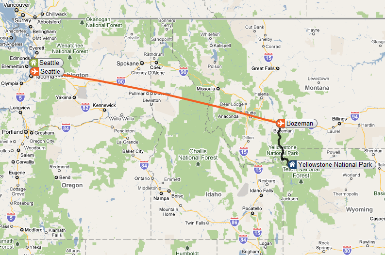
The map interface is perhaps the most immediately obvious differentiating feature of rome2rio. It certainly takes a lot of screen real estate (although this real estate is re-used for the flight schedules pop-out) however the value it adds varies a lot from query to query. For a search from one major city to another the map will display routes with stopovers, which may be of interest to the user. However the maps value really comes into play for searches such as Seattle to Yellowstone or Dublin to Le Havre where the visualization of the alternative routes really helps the user understand the tradeoffs between them. I suspect travellers with more flexible itineraries will also benefit from the map interface where they may notice one of the routes goes past a town or attraction of interest and decide to make a detour.
So, what are your thoughts about rome2rio’s current UI? Too confusing and geared towards savvy, high-tech users? Nice and snappy and easy to use? Do you like the map? Would you prefer an interface without the map, or one where the map takes either more or less screen space?
We’d love to hear your thoughts!

