In the last week we’ve pushed out several changes to the site’s user interface. We redesigned the experience so that flight schedules and transport information are no longer displayed using pop-outs over the map. Instead, clicking on each leg of the journey displays the relevant information inline above the map. Importantly, rome2rio now zooms in to show the selected leg in detail.
We’ve also made the date selection more intuitive to use. We hope this makes getting flight prices much easier than before. Of course, the date is completely optional because we love the experience of quickly browsing the flight options.
We greatly simplified the messaging on the welcome screen; a simple change that resulted in a substantial jump in traffic.

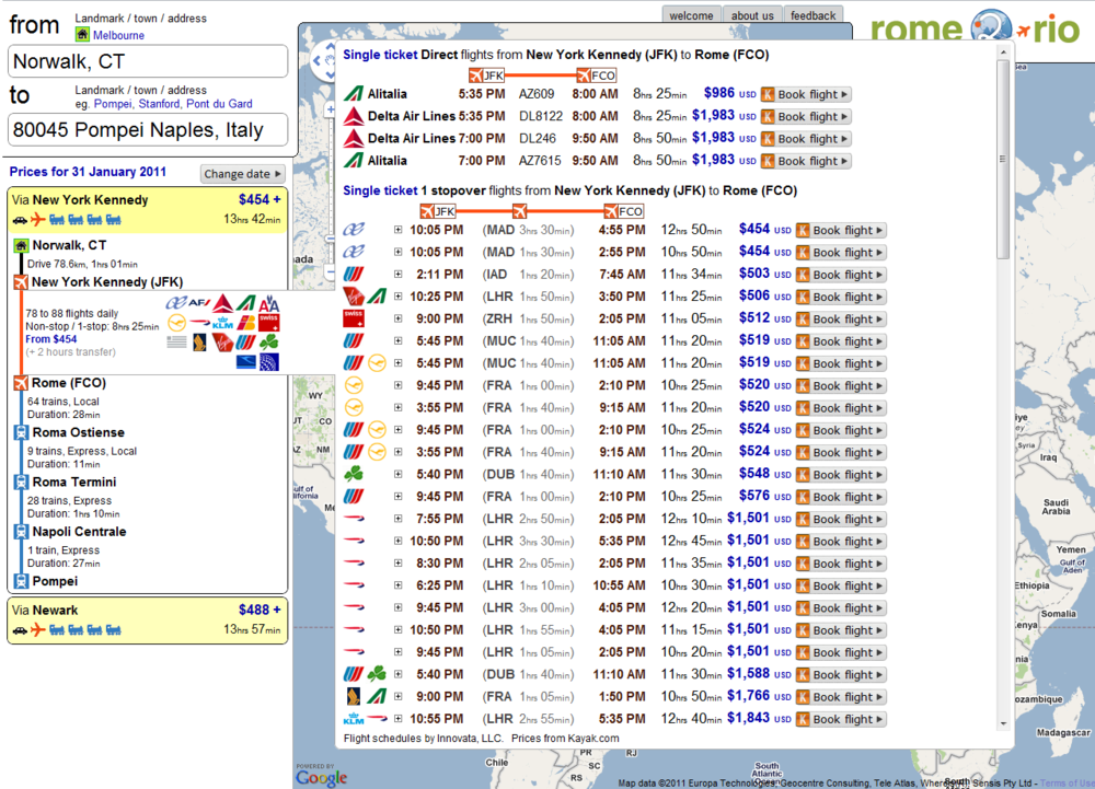
Getting the UI design for rome2rio right is challenging, and something we’ve blogged about previously here and here. Expect the design to continue evolving in 2012. To give you an idea of the progress we’ve made this year, here’s what rome2rio looked like back in January:
We also pushed out a new feature today. As we described in this previous post, rome2rio has an explore feature where users can view all direct flights from a single airport on the map. To activate this view, input an origin (but not a destination) and select an airport from the list of the left. Alternatively, input a 3-letter airport code such as SFO. As of today, you can filter the destinations displayed by airline. This is especially useful for viewing, for example, all destinations that can be reached by a direct EasyJet flight from Stansted airport.

Please let us know what you think of the UI changes.
Hi GadFly. I personally don’t like the way the map slides around with this new UI. But I like that you can see the itinerary and the map side by side.We’re trying to find a solution that keeps the best of both worlds. Maybe a way to collapse the itinerary view so you can only see the map. Or maybe multiple tabs or screens – so you can switch between the itinerary and map view (we lose the side-by-side but we gain lots of space). In any case, I agree with you – its a bit cramped right now.