Like most travel sites today, providing a great mobile experience to users is increasingly important. Just two years ago, mobile devices represented just 13% of visits to Rome2Rio.com. Today they represent 33% of visits, with desktop representing 54% and tablet representing 13%.
In 2012 we launched a responsive design which employed @media CSS tags to mold Rome2Rio’s desktop design onto the smaller display. The resulting experience was passable but not optimal.
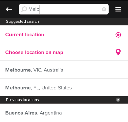
This week we’re excited to launch a new, separate web interface for mobile users. The layout is cleaner and easier to navigate with information laid out across more panels. The map is displayed on a separate screen, accessible from all pages via an array of button on the bottom rail. High resolution icons are now used. Most importantly, the performance has been substantially improved and the CSS and Javascript payloads have been reduced.
The screenshots below provide a comparison between the old and new interface for mobile visitors:
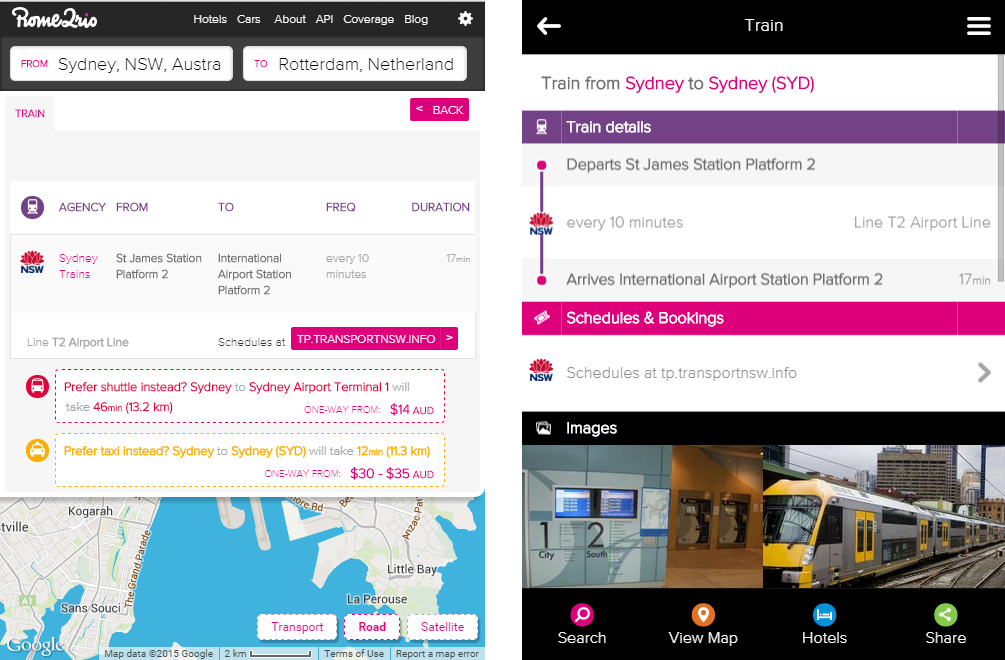
In the process of developing the mobile site, we took the opportunity to refine parts of our desktop site. For example, we refreshed the hotel view, left rail itineraries and transit details panel.

We also made some improvements to Rome2Rio’s multi-hop interface, which is perhaps the most complex part of the site’s design:

Some aspects of the new design have yet to ship and will roll out over the next month or two. These include more mobile friendly configuration menus and auto-complete inputs.
Chris on our team created a short guide to the new mobile interface:
http://www.youtube.com/watch?v=bf6YiP4rkig
We hope you enjoy the new design and find Rome2Rio even more useful for planning journeys and reviewing itineraries whilst on the road.
Hi,
there is 2 weeks I’m expecting a reply to a commercial query, trying all displayed email addresses on your website, as smtpuser2@rome2rio.com, feedback@rome2rio.com, api@rome2rio.com…
Is there anybody here ?
I’m CTO of an European landed holiday rentals reseller, and we may be interested to create some white labeled website with you.
Thanks to contact me as soon as possible.
Regards.
Will this also be rolled out for white label integrators?
Yes, we will look at migrating whitelabel partners over in the next few months. Cheers, Michael