It was early 2016, and I was sitting at my desk in Melbourne’s Inspire9 co-working space in a corner that Rome2Rio peacefully occupies. In front of me were printed out screenshots of the existing Rome2Rio flight booking user interface. We all knew that the user experience needed work, what we didn’t know is what direction we needed to go in to fix it. On top of that, concept-to-development would have to be fast to keep with the Rome2Rio ethos of experimenting in the wild rather than in the lab. This process was going to be a challenge … here’s what we did.

The travel industry is huge. In 2015 alone it generated $341 billion dollars in the US. I was sure that all the top companies had A/B tested their booking flows to the limit — it was time to do some research. I collected screenshots from some of the leading travel websites and printed them out. These would be my reference; something to continuously look back on throughout the entire process, something to benchmark my ideas. I laid out the printed screenshots, organised a meeting with the rest of the front-end team and so it began.

Flight tickets — the similarities and the differences
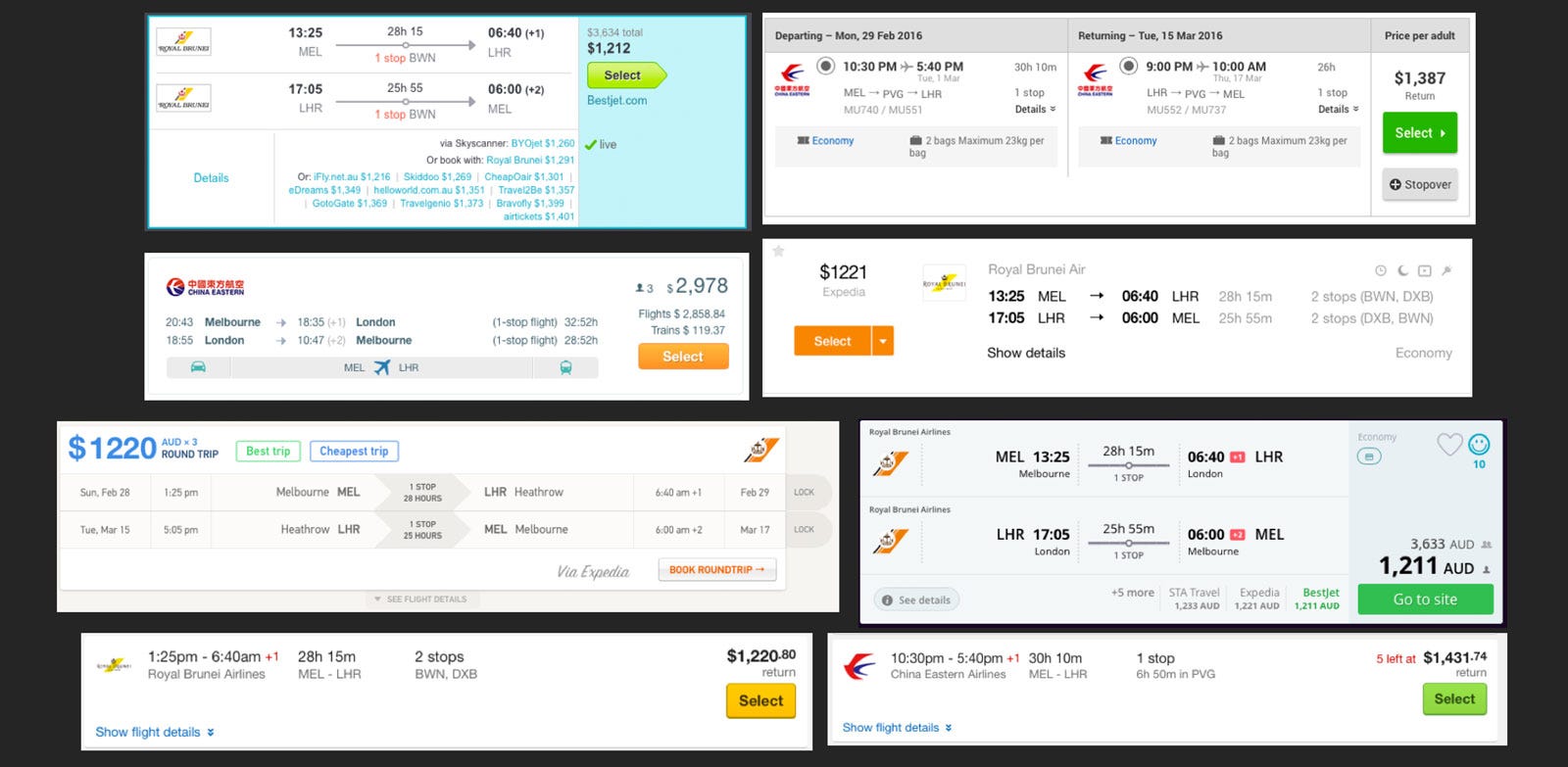
Step 1 was isolating the tickets used on eight big name flight booking sites and attempting to find similarities and differences.
Six of the eight tickets contained summary columns on the right-hand side; each ticket contained a button with either a green button or a button in the brands colour. I was onto something! Green buttons can’t just be a coincidence, especially when nothing else on the page, or in the brand, is the same green.
Another feature of the summary columns was per ticket prices. The search on all sites was for three adult passengers yet only GoEuro displayed the price for the entire order, all the other sites displayed the per ticket price. If users were going to be comparing Rome2Rio’s ticket prices to other flight search websites, we were going to need to display tickets in the same per-passenger format.

Outbound and return journeys are presented as rows, the exception being Webjet who presented the data in columns. This layout would make it easy to present one-way and return tickets using the same design without creating awkward white space. However, it is easier to scan a large list of tickets if the journeys are presented in column format so this was a real estate vs. convenience challenge; one which we may re-visit in the future.
Another similarity we found was the use of +1/+2 to represent international dateline changes. This is common in long distance flights that span timezones. We’ve talked about other ways we could present users the date of their arrival if it’s different to their date of departure. However, this research seemed to reinforce a standard, one that we’d be brave to deviate away from.
It’s all in the details

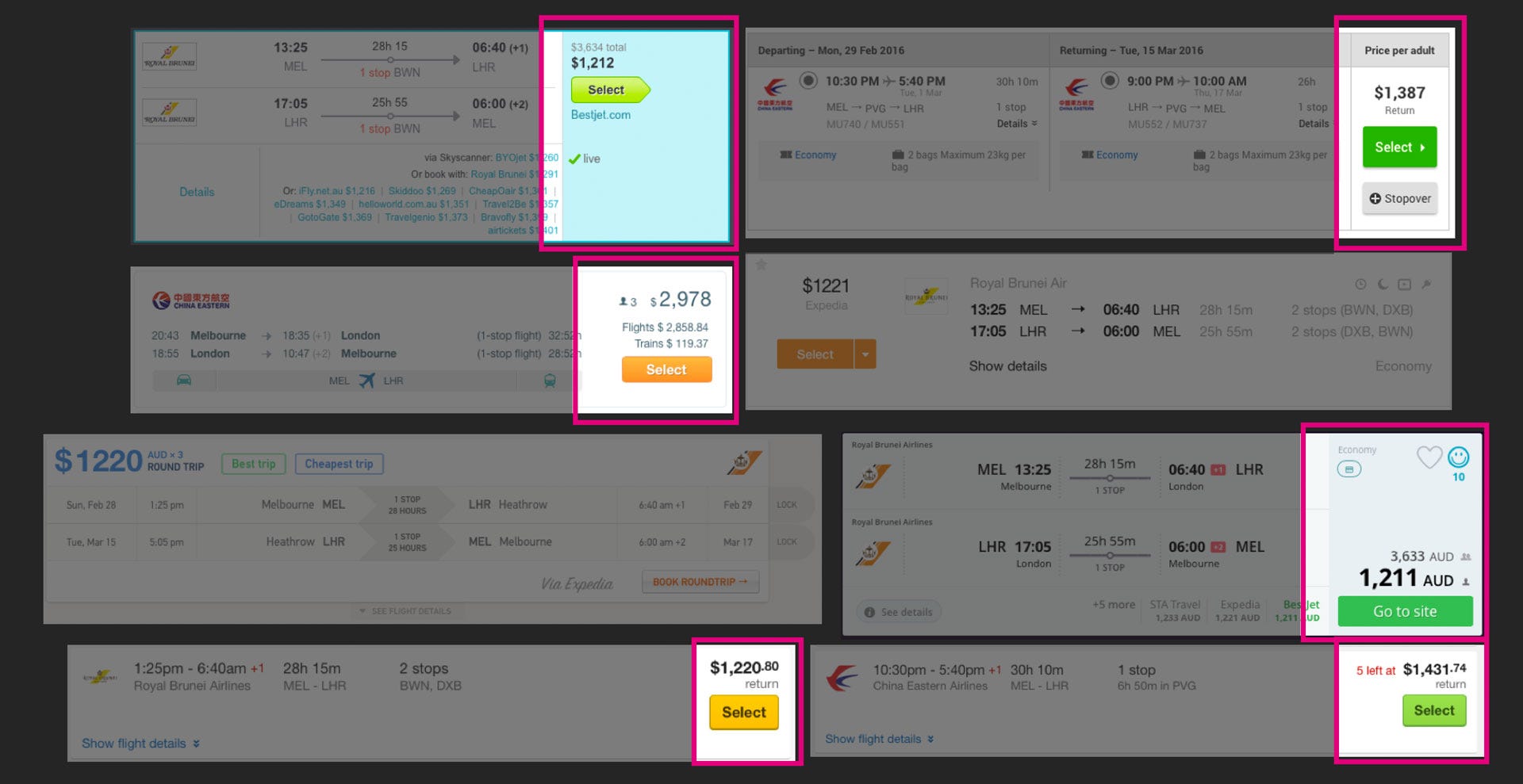
Another thing I quickly noticed is that what was presented on the ticket result wasn’t the full story. All but Webjet and GoEuro used the term ‘details’ in their call to action to view more information about the ticket. The wording and methods of progressive disclosure were consistent across the sites. The call to action was always located at the bottom edge of the ticket result and mainly towards left side — as far away from the main call to action as possible. I wonder why? In 100 Things Every Designer Needs to Know about People, Susan M. Weinschenk suggests that progressive disclosure provides people with the information that they need only at that particular time.
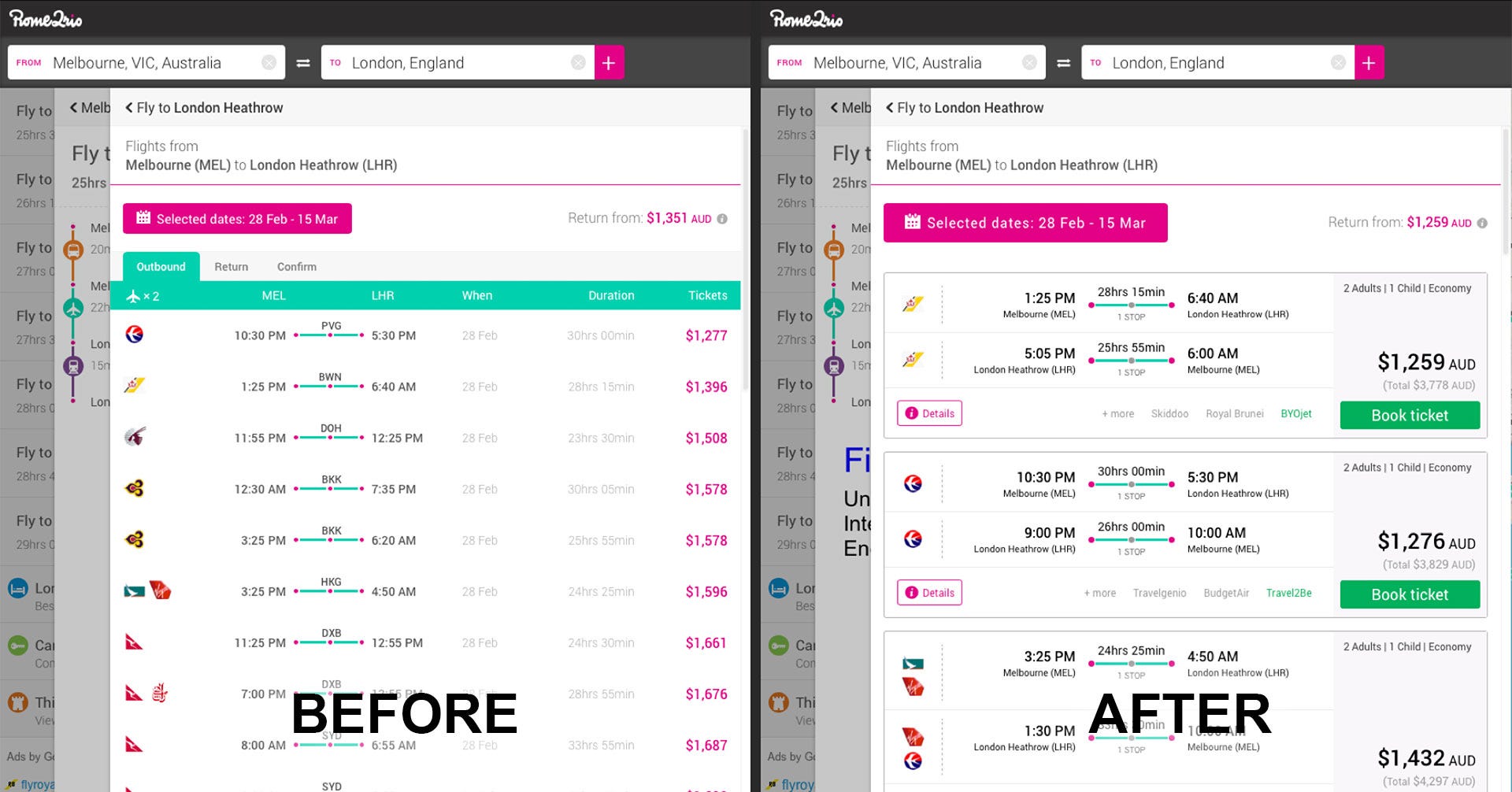
Armed with detailed knowledge about what users expect from a ticket I designed and built a concept for the Rome2Rio ticket. After about a week I came up with a candidate to test in the wild.
Our split testing method
As a rule at Rome2Rio, we split test all features and improvements. Some of the benefits to split testing everything are:
- Gives us a deep understanding of just how much impact a change we make has.
- Allows us to quickly turn off new features/improvements if something went wrong.
- Forces us to develop code that’s decoupled, more flexible, and better designed.
We ran the experiment at 20% English Language, desktop users. It was a fairly small sample size of our entire user base. However, it was big enough to get us accurate results while still insuring us against the possibility of failure.
So the results?
Users were 61.5% more likely to make it through the booking process with the new flow.
Admittedly this was an easy win project as the old design was in serious need of an upgrade however it’s incredibly rare to get this kind of increase overnight on a high-value part of the product. We graduated the experiment to 100%, ported the design to desktop, removed the legacy code and eventually submitted the new strings for translation.
The journey has just started
Conducting this research and experiment process wasn’t about an end goal, it was about creating a solid, well-researched foundation for future experimentation. I’ll soon be posting some more articles about future enhancements we’ve since made and the results they’ve had to our booking counts. Until then feel free to check out the work we’ve done and make any suggestions on how we can improve the flight search experience!
You are the best! Your informations are precious an true! Even for Romania!!!! I wish you more and more succes. (Excuse my English…) Greetings from Cologne, Renate Göckler-Timoschenko (born in Romania)
Interesting that such a small change makes such a big different. RE the low conversion rate for people clicking ‘more details’: my wife and I often do this for one of 3 reasons:
1. To check other sites: a lot of the time, we use 3-4 meta search sites to find the best booking – and always prefer if we can find a method that uses paypal (this reduces international fees for us) or low credit card fees.
2. To check stopovers – often multi-leg flights have awkward stopovers and it can take a lot of searches/date changes to find convenient departure/arrival times.
3. Still thinking – if we don’t think flights will go up in price any time soon, it’s better to sit on the decision for a while.
You might be able to increase conversion rate for 1 by increasing the number of partners searched for bookings. For 2, while many flight booking engines have improved in their presentation of alternate flight times, I think the user experience for finding the right flight could be improved (page load times and intuitive itinerary displays are particularly important). As for 3, an option to notify by email if the price increases would be cool.
Webjet actually use the word ‘Details’ too. 😉
I hesitated previously to use Rome2Rio flight booking function (preferred to use Momondo), the new version looks like I will give it a try. For 2018 would really like to set a planned route (Helsinki – Rome) -> pre-authorize an allowance for the site Rome2Rio (i.e. 200$) and let the engine book the flight when it deems the best (the savings between the final price and the budget will be split between the user 60-80% and service provider 20-40% depending on how good flight it was on scale 1-10).
For holiday it doesn’t matter that much is your flight time direct or 2h extra with an layover and people use tens of hours to hunt for the best deal.