Schematic maps are a fantastic tool for everyday use on public transport. They are intuitive, fast to read, elegantly designed and most importantly, we have them for most cities. Take the famous London Tube map for example. How do I go from Wimbledon to the Olympic Park in Stratford? Easy: District+Central, or District+Piccadilly+Central. The reason it is so easy to get around London is because the Tube map is very user-friendly.
The London Tube map (or any other metro or bus map) tends to be much nicer looking than the real underlying network. You can see a comparison of the schematic and the real map below:


But there is no schematic map of the Amtrak in the US, or of Greyhound in Australia. Actually, there are almost no maps of national or regional public transport networks in the world! So, we started a project to create a tool that would allow us to automatically generate these national transportation maps from the data we use in our routing engine. The reason we want to have this tool is to provide a quicker way for our users to get a sense of what areas of a country or region are covered by a transportation agency. We also wanted to include this information in our travel guides that we recommend you use while planning your trip!
The book One Metro World by architect Jug Cerovic gives a pretty good insight as to what makes a nice looking map. It’s definitely a book I recommend for anyone that likes design and maps. It talks about keeping consistent soft angles, the schematisation of lines as well as rhythm and symmetry in the layout.
During my internship at Rome2Rio, I built a system that is able to generate schematic maps from the routes data that Rome2Rio uses in the search engine. As part of my PhD, I am working on Discrete Optimization applied to graph problems, so this project was a perfect fit for me and I am really happy to have been able to work with real data and generate something so appealing to the eye. In the rest of this blog post, I’ll explain more about how the system works and what its limitations are.
Drawing the maps
There is actually quite a bit of academic research about this topic, and many techniques have been tried to address this problems [1,2,3,4,5]. Nonetheless, we haven’t found anyone able to scale their solution to big networks like the ones we are looking at. One of the great things about Rome2Rio is that we have a lot of data. So I was able to test the tool on multiple networks and even connect them.
Making schematic maps is a problem that falls into a category called “NP-hard” in computer science. In short, this means that our problem is highly combinatorial and therefore computationally expensive (ie. very slow). No fast algorithm exists to produce answers for this kind of problems. But of course, they are everywhere: delivery routing, airline planning, cargo packing, scheduling doctors and nurses in hospitals, etc. However, there are ways of attacking such problems that, although slow, can produce good results.
To sum up, what we want are maps where lines take only certain angles (0, 45 or 90 degrees), where the lines don’t have too many bends, where lines do not cross unless they also cross in real life, and where station names are displayed in a clear way (ie. they don’t overlap and their position is not ambiguous). We also want the map to be relatively small. This is hard to balance because as you can imagine, to make a map small, you tend to bend lots of lines. Balancing these two objectives was one of the challenges of my work.
The Magic of Discrete Optimization
To attack this problem we decided to use Integer Programming. This technology allows to model the problem with a set of variables and adding constraints over them.
At the core of the problem we have to decide where we want to put each station, that is their (x,y) coordinates, in order to make the maps look “pretty”. To do so, we establish relationships between stations.


Between every two adjacent stops there is a certain angle, and the stations are constrained to keep an angle similar to that one. For example, the angle between Sydney and Newcastle is 70 degrees (more or less), therefore the link between Sydney and Newcastle will have to be either vertical (north, 90 degrees) or diagonal (north-east, 45 degrees). How far north or how far north-east? We let the Integer Program Solver decide. This is repeated for all adjacent stations so, for example, we also say Karuah is somewhere north or north-east of Raymond Terrace, which is in turn somewhere north or north-east of Newcastle and so on. These decisions – choosing between north or north-east – is actually the core of why this problem is computationally complex.
In addition to this, the model carries constraints to avoid stations being too close to each other, and lines crossing with each other. We also take good care of the angles at intersections to keep relative positions around the interchanges. For instance, in the image of Norway below, we wouldn’t want the line going north from Myrdal to be swapped with the line going east.


Drawing parallel lines and interchanges
One of the major difficulties was being able to draw parallel lines. Drawing them is not hard, but figuring out how to connect them at the intersections is not easy. We used a Constraint Programming model to tackle this. In short, the difference between Constraint Programming and Integer Programming is that it is possible to model more complex constraints easily in the first than the later. Which one is faster typically depends on the problem and its size.
The way parallel lines are drawn is through the drawing of the interchanges. They look like this:

As you can see in the picture above, some stations (eg. Redding or Reno) are drawn as a simple circle, because only one line goes through. But consider Albany: there are two lines going through so we need to draw the lines parallel to each other. To draw this, we use a Constraint Programming model to select the best possible layout of the interchange and where we want the coloured dots to be inside the interchange itself.
If you look carefully, you’ll notice that the blue dot on the Eugene stop is empty (it’s just a circle). This is because the blue line actually finishes in Eugene. And why doesn’t Oregon City have an orange dot? Because the orange line passes through Oregon City but does not stop.
Interchange stations can take different shapes in order to adapt themselves to the layout of the lines:

One major issue with parallel lines that you never see in city maps is that there can be a lot of them. If you look at big city networks like Tokyo, Beijing, New York, London or Paris, there are places with 4, maybe 5 or 6, parallel lines. On the Adriatic (eastern) coast of Italy, there are more than 40 lines between two cities! Drawing them parallel to each other is going to provide a very big map, and hard to read. So we decided to compress these lines into something that would take less room and convey the same information.
The picture below shows a bit of Italy, between Rimini and Ancona. Having that many parallel lines is not a good visualisation, so we came up with a more compact version of these lines.


Arguably, this is not a perfect solution. But it is much better than having a massive blob of lines taking half the map!
Adding Station Names
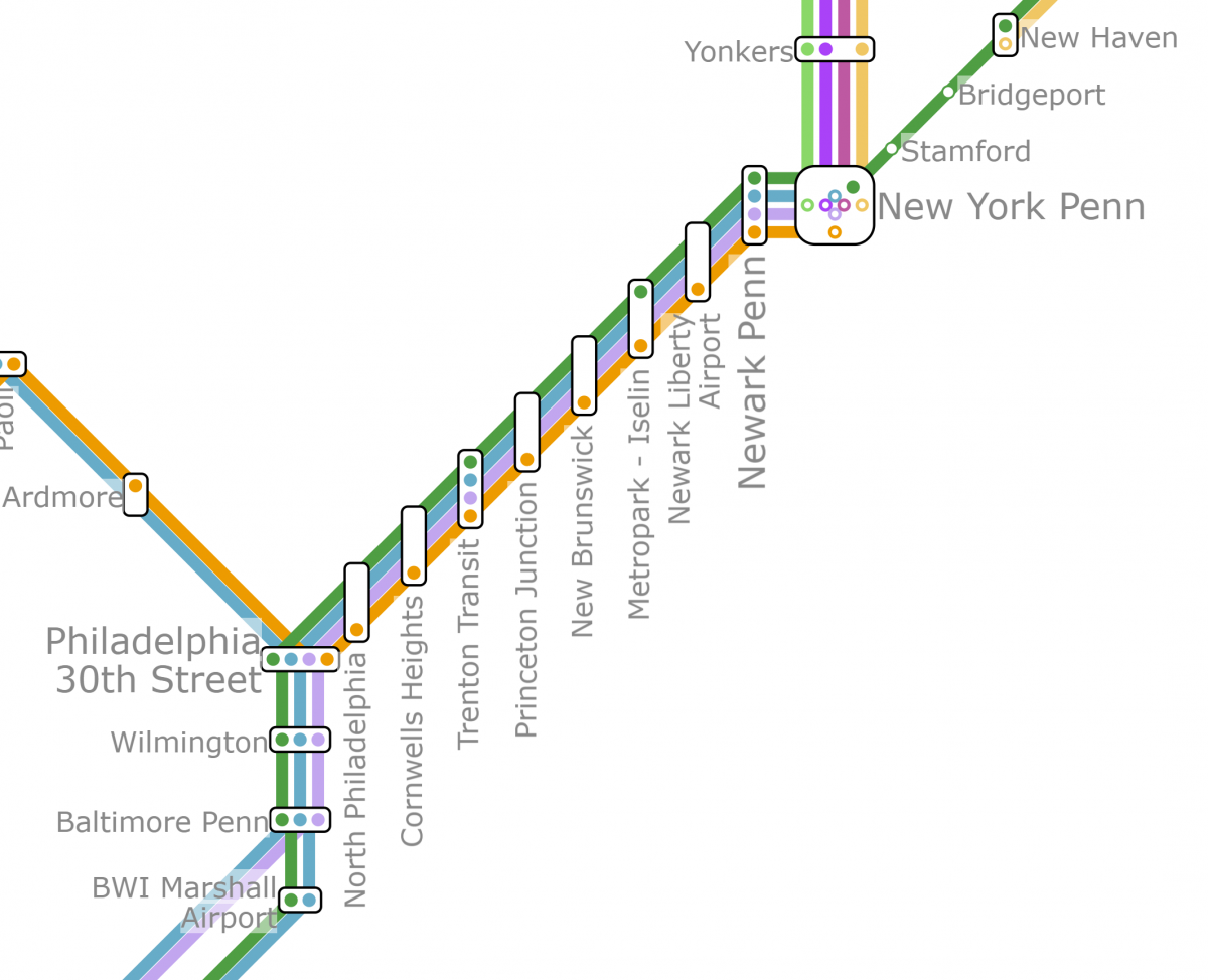
To draw the station names, we used yet another Integer Programming model that avoids the names overlapping with each other or with other stations. In our tool we allow several positions for each station name: eight horizontal positions around the corresponding station, and two vertical positions (i.e. the text is at 90 degrees). This is typically avoided by map designers – you’ll rarely find transit networks with text on a 90 or 45 degree angle, but for nationwide networks it makes sense. Imagine how much space would be needed to draw all the stops between Philadelphia and New York if they had to be written horizontally!

Conclusion
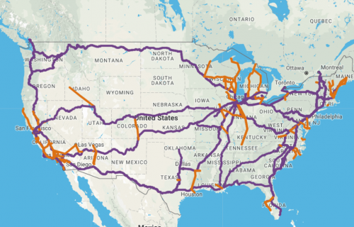
In the end I was able to build a system that did what we expected. It does have some limitations, and some things still need more work (like those massive parallel lines) but all in all, the results are pretty good. The system scales surprisingly well with the size of the network. Small networks (like Estonia below) is generated within seconds, medium size networks are ready in minutes and only the biggest ones (like AMTRAK or a combination of several Balkan countries) take around 2 hours. On the flip side, it doesn’t do as well when the network data isn’t particularly clear – the data that Rome2Rio uses for routing is sometimes too accurate for this application, and some networks with high station density (like Renfe in Spain or Trenitalia in Italy) become surprisingly hard to draw.
Below are some of the maps the tool generated automatically (click on all the images to see them zoomed-in). I hope you enjoy them as much as I enjoyed my internship at Rome2Rio!
Estonia (Elron trains)


Portugal (Comboios de Portugal trains)


United States (AMTRAK trains)

Korea (Korail trains)

Geographical data of agency Korail
