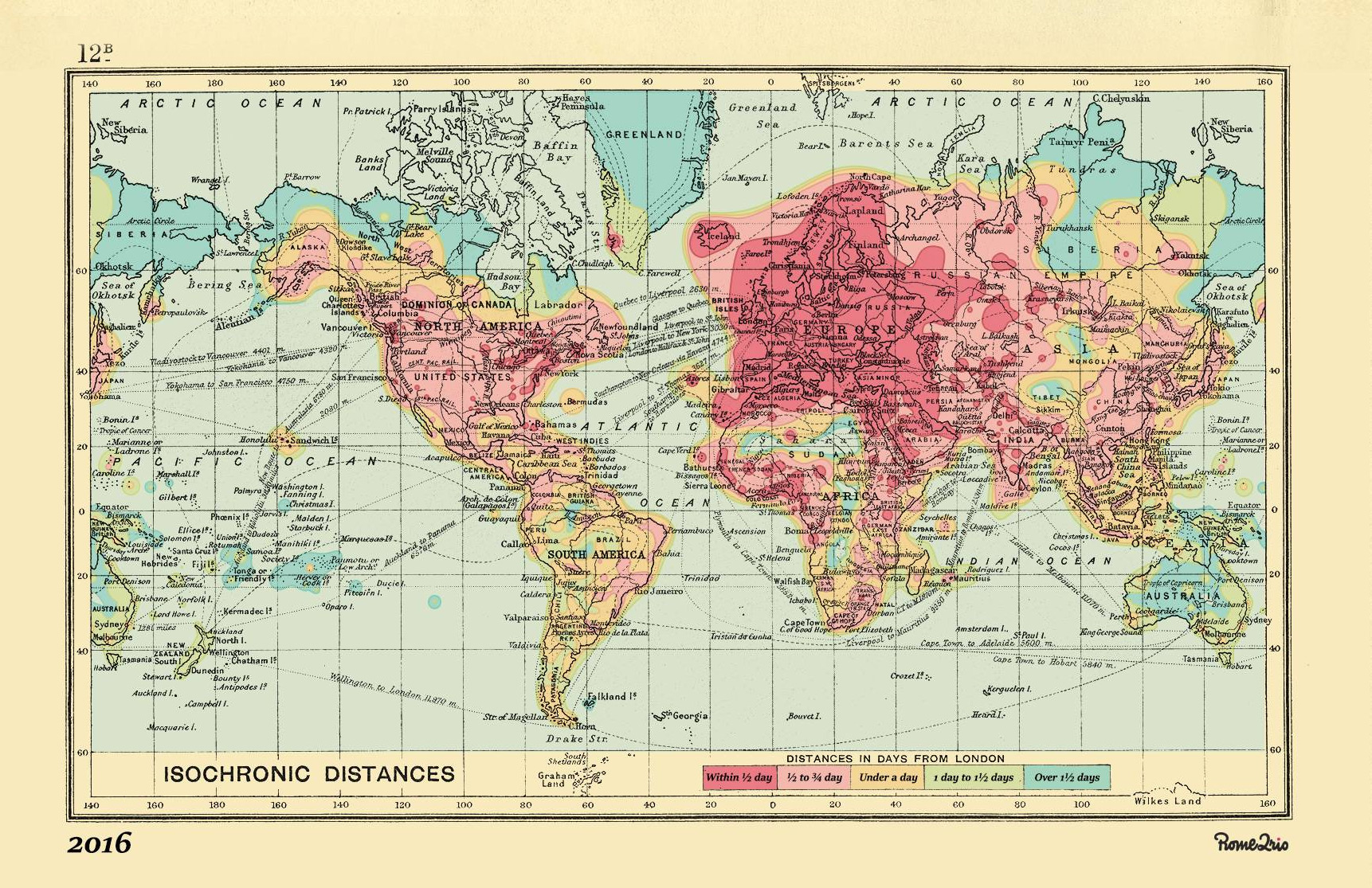
In late 2015 the Rome2Rio team spotted a beautiful travel map on Intelligent Life. The map, which was published by venerable mapmaker John G. Bartholomew in 1914, illustrated how long it would take to travel from London to destinations across the globe.

We were excited to see such a fantastic visualisation of travel times and we were curious to see what had changed in the 100-odd years since; especially at such a world-changing juncture in travel technology. The first commercial flight took place on January 1st, 1914, so travel times started changing drastically soon after this date.
We created a new map using Rome2Rio’s routing engine and unique repository of transport data. What we uncovered was fascinating.

It is clear that travel times have improved immensely. Modern air, rail and road infrastructure has led to a ten-fold increase in travel times across the dark pink parts of the map.
Globalisation is also readily apparent. Journeys that would have taken 10 to 20 days by boat and train have been replaced by the speed of air travel, with most of the world now accessible within ½ to 1 day. This change is most apparent in Asia. In 1914 reaching Beijing, Shanghai, Hong Kong and Tokyo would take up to 40 days. Now, these powerhouses are a day’s travel from London.
Island destinations have benefited from the advances in technology as well. Locations such as the Bahamas, Bermuda, Seychelles, Mauritius and Madagascar are all with ½ a day’s travel, suggesting demand for direct flights by holiday makers. For those who prefer colder locales, visiting the world’s coldest city, Yakutsk, is a breeze in comparison to the area surrounding it; from London, it takes ¾ of a day.
The 2016 map also showcases the dramatic increase in transport hubs across the US. Once you would arrive on the East Coast and trek out west by train. Now, direct flights will get you to San Diego, San Francisco, Minneapolis, Dallas, Houston and Denver.
However, the improvements have not been evenly distributed and some areas remain quite inaccessible. Greenland, Northern Canada, Siberia and the interiors of Africa, South America and Australia will still require some days of travel to reach.
If you still long for an extended trip then perhaps a trip to Buenos Aires is in order; the direct flight from London takes 15 hours – plenty of time to enjoy the in-flight entertainment.
Hi, great map 🙂 Any chance you have a higher quality jpeg version of the map? Would like to print it out.
Thanks!
Apostolos
Hi there and thanks! We are working on an option for you. Hang tight and we’ll let you know when we got something for you. – KP
Hi Apostolos. We now have a map available to purchase, created in partnership with Wellington’s Travel
http://www.wellingtonstravel.com/isochronic-map.html
-KP
Any ETA on that hi-res version? Looking to print it as a gift, willing to pay a moderate sum 🙂
Thanks!
Hi Bryan – we have some news about this really soon. Hold tight!
Hi Bryan
We now have a map available to purchase, created in partnership with Wellington’s Travel
http://www.wellingtonstravel.com/isochronic-map.html
-KP
I’m sorry, but it’s just not the same without the routes, annotations, styling, etc. This map looks pretty barren — sadly suggesting no reason to leave London.
Also, I was hoping to have both the 1914 and 2016 together at the same scale (or at least closer than the inlay), either as separate images or a single top/bottom image, for the juxtaposition.
Do it right and I’ll pay for it. (Yes, that’s blunt. I’m American.)
p.s. I work in a creative field, so I do appreciate the work that must have gone into this. It’s just not ready yet.
Hi Bryan, thanks for your comments. We appreciate it. Here’s a bit of context for certain design decisions we’ve made.
The 1914 map is a single, low-res image. We had very little ability to make the changes required to bring it up to 2016 reality. For example, we needed to change borders, country names, city names, and so forth. We also needed to “move” certain cities to correct for errors in the 1914 map. Because we couldn’t pull the original map apart to edit all these items, we had to source a new, higher-res base map then layer our isochronic data over that.
We totally get your point about the 2016 map not looking old, but at this point we are unable to make any more changes… making maps is not even close to our core business! We are busy with tons of projects for rome2rio.com, and sadly have no more resources to throw at the map project.
Is it possible to create the same 2016 map, but without including flights? I’d imagine many places are further away than they were a hundred years ago.
Quite true! It’s something we might look at doing in the future but not at the moment. We are working on some other cool stuff we’ll share soon.
wow, nice! thinking about purchasing this map. great article btw